Wednesday, February 08, 2006
That's more like it
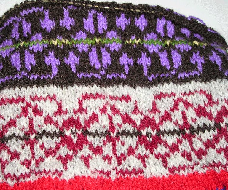 Would you believe the top and the bottom motifs were knit from the same chart?
I'm much happier with the top one. It give me hope for the project. The two-hands, two color is less lump and more even. I still need to take a gauge measurement...... And if it's a colorway already in use in marketing a particular product, I'm not seeing the product.
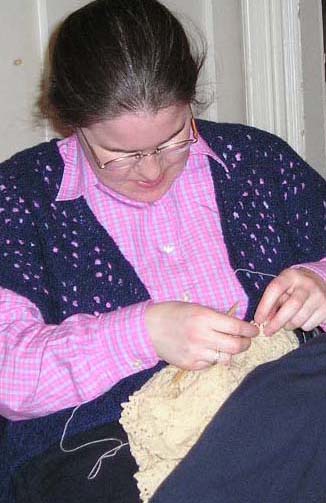
I'm a bit discouraged that at this point, 2 nights before we're allowed to cast on, I still have no vision of what I want the finished tam to look like. I usually start a project knowing what sort of a thing I want. It will look like that picture, except...... Well, part of my challenge is that I'm allowed to use any of the charts Mary Rowe includes in her book, but not replicate a particular pictured tam. In general life I can copy, but that's not the point of this exercise, is it?
I suppose I'd best start with measuring my gauge, which will let me know which of the charts will fit the numbers. Then will come how many colors I want to use and how I'll vary the colors within. Then which colors to use.
Trust me, you don't want to be around when I have to choose ice cream at a stand I've never been to.
![]()